After confirming the layout, you can start customizing your Flip Box images. Add your own content and the image and customize it in your own way. Also, you can keep the design as it is. It’s up to you!
Here in this tutorial, you’re going to learn how to edit a pre-built layout and customize it in your own way. So let’s get started:
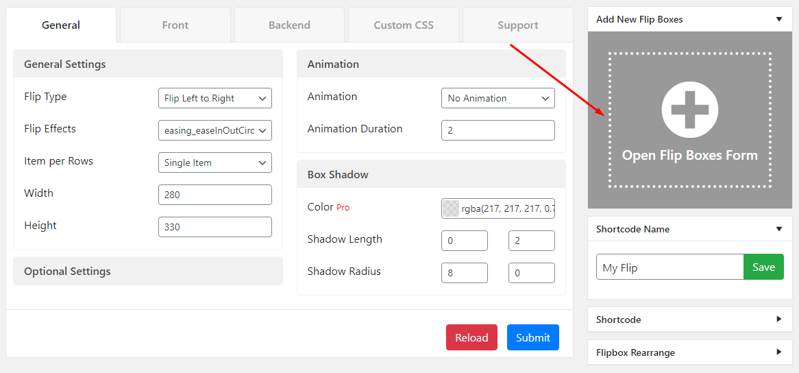
Add New Flip Boxes
To add a new flip box image item, click on the Add New Flip Boxes (+) button. After clicking that button, you’ll find a Hover Modification Form to upload the flip image and add info.
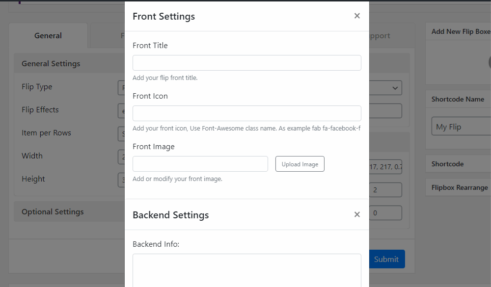
Add both front-end and backend image for the flip box effects.
Here in the flip box form, you can add both of the front and backend flip images and their title, icon, info, button, and link
Edit/Delete the Flip Image
After selecting a layout and creating flip boxes, you can see the live preview at the bottom side of the editor page. When you hover over the image’s body, you’ll find the edit and the delete button. See the image below,
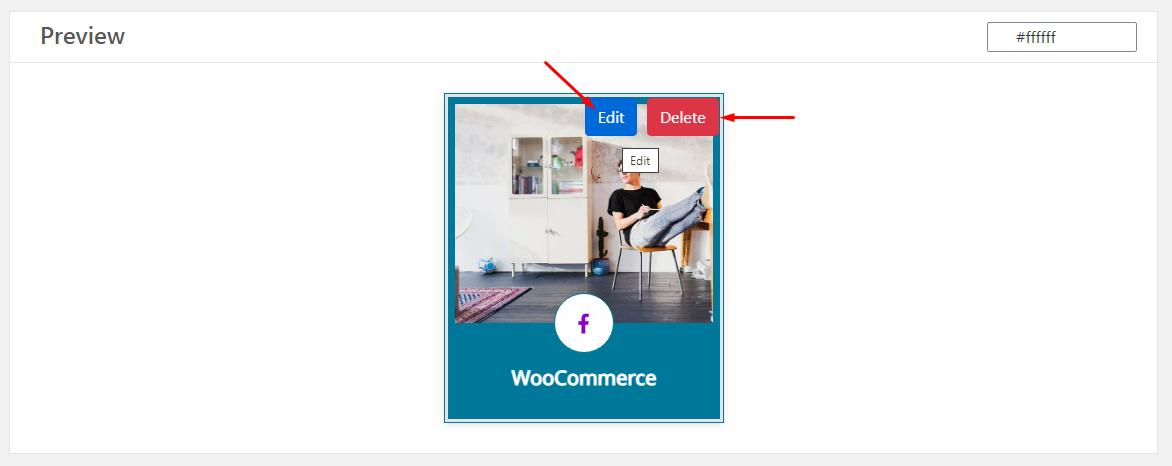
By selecting the Edit icon, you’ll find the flip modification form. Here you can customize the flip box images. And by clicking the delete button, you can remove the unnecessary image.
Flip box Rearrange
Made a mistake ordering the images? No worries! We have the lightest drag & drop rearrange tool. Just click on the button, and reorder your images manually as you wish.

General Settings
After adding and customizing the responsive tab items successfully, you can customize the styles more precisely as we’ve added a maximum customization panel for you. At the first of this panel, you can find the “General Settings” section along with 2 sub-sections. Now, let’s see how to edit this section:
General Settings: First sub-section is the General Settings section. Here you can set some basic components for the tabs. Here below, these are shortly explained:

- Trigger- Enable trigger to close the tab’s content with a second click on the same tab.
- Activator Event- Select the activator of the tabs. This will set either your Tabs will open on Click or Hover.
- Initial Opening- Select which tab will open after the page load initially.
- Animation- Add Animation Effect on the tabs opening. So many options, you’ll find here to add animation effects.
Header Settings: The other sub-section is Header Settings. Here you can customize the positioning of the tab and set the responsive behavior. Here below, these are shortly explained:

- Tabs Alignment- Set the tab alignment type on the tab’s container, select either horizontal or vertical. And then customize the settings according to this selection.
- Horizontal Position- Set the horizontal position of the tab’s header
- Vertical Position- Set the vertical position of the tab’s header
- Header Width- Customize the header width (Pixel, Percent, or EM)
- Responsive Behavior- Set the Responsive Behavior of the tab’s header while Static will give you to set your custom settings as follows:
Tabs Settings>>

Horizontal Position- Set the horizontal position of the header either column, row, or compact.
Title- Show/hide the title on tabs mode
Sub Title- show/hide the subtitle on tabs mode
Icon- Show/hide the header Icon on tabs mode
Number- Show/hide the header number on tabs mode
Image- Show/hide the header Image on tabs mode
Mobile Settings>>

Horizontal Position- Set the horizontal position of the header either column, row, or compact.
Title- Show/hide the title on mobile mode
Sub Title– Show/hide the subtitle on mobile mode
Icon- Show/hide the header Icon on mobile mode
Number- Show/hide the header number on mobile mode
Image- Show/hide the header Image on mobile mode
This is the first basic section of the editing panel. You can customize more in the next section. These will demonstrate in a separate tutorial. Stay tuned!